Chart
The form field is used for displaying data on the form by means of one of the four available charts: Line, Bar, Pie, or Donut.
For the correct configuration of the Chart form field, the selected data source must return at least 2 columns:
- Data series – which contains numeric values,
- Label column – which makes the horizontal (category) axis for line and bar type charts. For pie/donut charts, it provides names for individual sectors.
Essentially, a data series can be presented in 3 distinct ways using 4 types of charts:
- Line – it presents multiple series of data on one graph,
- Bar – numeric values are represented by rectangular bars. If multiple series are projected on the horizontal axis, every category features multiple bars. They can either be displayed as adjacent to each other (grouped) or cumulated on top of each other (stacked),
- Pie – only one data series can be displayed. The contribution of each category (label column) to the total "pie" is represented by sections proportional to the value of positive elements of the series (data series),
- Donut – functionally identical to a pie chart, with the exception of a blank center.
Even though the Chart form field is primarily used for presenting data, the various types of charts possess a number of interactive functions activated on the form itself, .e.g. hovering the mouse cursor over various elements of each chart displays additional information about the series.
Charts displaying multiple data series offer the option to freely hide/show the individual series by clicking their respective legend icons in the top-right corner. Clicking an icon once hides that series, whereas double-clicking a non-hidden series hides all other series. Clicking the last remaining non-hidden series shows all series (the default view).
Bar charts can be switched between Grouped and Stacked modes. The former displays individual bars for each series adjacent to one-another, grouped by category. The latter takes all bars for one category and stacks them on top of each other.
Clicking a sector of pie and donut charts highlights it.
To learn more about configuring Charts, read the ARTICLE available in the WEBCON Community website.
Advanced configuration
The window offers advanced configuration options for the Chart form field.
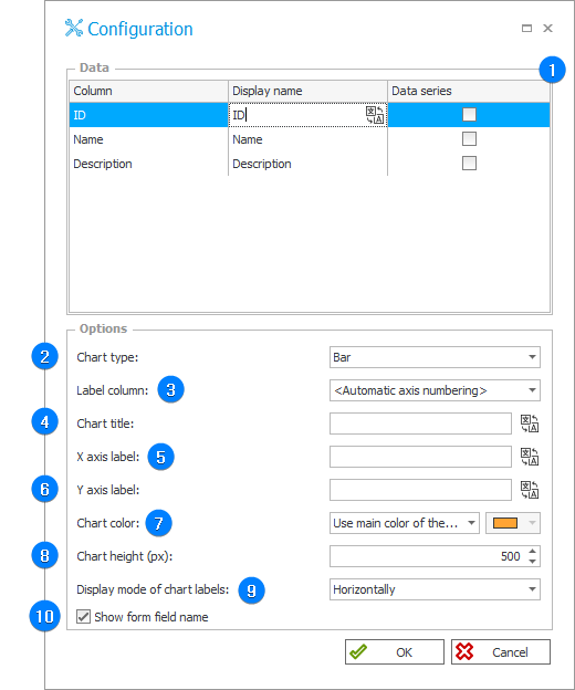
1. Data
The table displays all the columns returned by the data source. The “Display name” column is used for defining the displayed names and various translations for the series.
The Line and Bar type charts can support multiple data series. Columns that are marked as data series should contain numeric values.
The last section of the table, i.e. Color on chart only appears if the Use data series color option is selected in the Chart color field for Line and Bar type fields. A custom color may then be selected for each individual data series.
2. Chart type
The field allows you to choose one of the four available chart types (Line, Bar, Pie, and Donut).
3. Label column
Column containing values which makes up the category (horizontal) axis for Line and Bar charts. For Pie and Donut charts, these are the names of individual chart sections.
4. Chart title
Text displayed above the chart.
5. X axis label
Label for the horizontal axis displayed below the chart.
6. Y axis label
Label for the vertical axis displayed to the left of the chart.
7. Chart color
The field allows you to define the color of the chart according to the color scheme: the main website color, website background color, or selected color. For multiple data series it is also helpful to define the main color for each data series by using the Use data series color option.
For Line and Bar charts it is possible to set individual colors for each series. Selecting the last option adds another column to the Data table where you can set custom colors.
8. Chart height (px):
The option allows you to define the height of the displayed chart by specifying the height in pixels.
9. Display mode
The drop-down list allows you to define how (Horizontally or Angled) labels describing the X axis are to be displayed. (The option applies to Bar and Line charts).
10. Show form field name
The checkbox allows you to specify whether the form field name is to displayed above the chart.