Choice field
A standard from field which allows the user to select defined values from a drop-down list.
The basic configuration of form fields is presented in the General form field configuration.
For more information on form fields visit the following WEBCON Community websites:
The Data source field on the right allows users to specify the source of values used by the choice field. A user can select one of the following options: Connections – specifies how the system connects with a given data source (server, URL address, or login and password), Data sources – specifies a relevant data source. It is possible to overwrite the query which was configured in the data source.
To access the advanced configuration options for the form field, it is necessary to select a data source first.
The values in the Choice field are stored as ID#Name (i.e. in the BPS format).
You can set values in the Choice field following one of the methods described below:
- by using the default value,
- on the form (manually or automatically through a form rule/JavaScript),
- by using an action changing the field value,
- by initializing the Item list (for item list selection columns).
When you submit an ID (without a name) or a Name (without an ID) to the Choice field, other related form fields will always be set in accordance with the destination field configuration.
If you set the Choice field with a value in the ID#Name format, the values set depend on the context of the call:
- if the default value is entered in the form of ID#Name, the associated form fields will not be set,
- if the ID#Name value is entered differently (user inputs on the form, rule change, change with an action), the associated form fields will be set.
For choice columns in the Item list:
- if the default value is entered in the form of ID#Name or the Item list initialization value is in the form of ID#Name, the associated form fields will not be set,
- if you enter ID#Name differently (user inputs on the form, change through the rule), the associated form fields will be set.
It is also possible to configure value search and data source filtering.
Settings
The section Settings is available in the bottom, right corner of the General tab. The field Behavior available in that section allows you to define one of the three operation modes of the form field. You can choose one of the following options:
Drop-down – selection of one value from a drop-down menu;
Popup search window – displays a new pop-up window allowing users to search and select multiple values (in the case of a pop-up window it is possible to select multiple values).
Autocomplete – a text field which dynamically suggests answers depending on the entered characters.

Advanced configuration
The window provides access to advanced configuration options and is divided into two tabs:
General
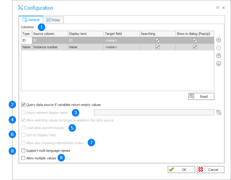
1. Columns
A list of columns used by the Choice field. Each row contains the following options:
- Source column – the name of a column in the data source,
- Display text – the name that appears in the pop-up dialog window. You can provide translations for the display name which will be used depending on the user's Portal profile language. To provide a header translation, click the
 icon.
icon.
The table's first row corresponds to the column whose value is stored as a Choice field entry identifier. The source column should contain unique values. The second table's row represents a column whose value will be displayed in the field after selecting the value.
2. Query data source if variables return empty values
The checkbox allows you to define whether the system will allow to use tags with empty values. Once checked, a query containing tags with empty values in the Choice field will not return any results.
3. Empty element display name
The name to be displayed in the drop-down list that indicates whether the value in the Choice field has been selected, e.g. entering the name "---Select---" results in displaying such an item in the drop-down list. When a user selects such a value, the system regards it as a non-selection. If a form field is set as required, it is not possible to proceed to the next step.
4. Allow selecting values no longer available in the data source
This option causes the values saved in the database to be added to the Item list in the drop-down list. The functionality is useful when records have been removed from the data source. The instances saved in the database will have archival value and on new instances you will be able to choose only current values present in the data source.
5. Load data asynchronously
The option is used by the Choice field (tree) column on the Item list. When checked, asynchronous data loading is activated – the data are loaded when expanding items on the tree (clicking the nodes). When unchecked, all data are loaded at once.
6. Sort by Display Field
If you select the checkbox, the values are sorted with reference to the field set as a display field. It is the second row of the configuration table of the Choice field columns.
7. Allow also choosing intermediate nodes
The checkbox is available only for the configuration of the Choice field (tree) column on the Item list when the tree structure is defined by the ParentID column.
8. Support multi language names
The option allows you to activate translations provided for the user's profile language.
9. Allow multiple values
When checked, a user can select many values using an additional selection window.
Choice field column headers can have defined translations into languages added in Designer Studio (System settings → Global Parameters → Translation languages).
The original text of the column is displayed whenever:
- no translations have been entered,
- there is no translation into the language selected by the user.
In any other cases, the translation is correctly matched with the currently selected language (in the system language preferences).
Sample translation of the Employee column in Designer Studio
Picker
The tab is used for configuring how an entered text is searched and managing values from outside the data source (i.e. allowing user to add their own values).
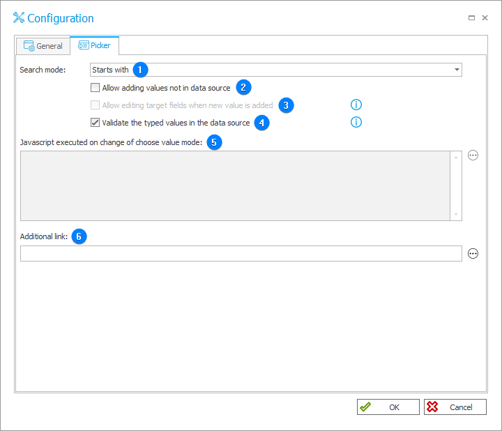
1. Search mode
The drop-down list allows you to determine how the searching is performed. There are three search modes available: Starts with, Contains, and Exact match.
2. Allow adding values not in data source
Selecting the checkbox activates the Allow editing target fields when new value is added and Javacript executed on change of choose value mode fields.
The option allows users to select a value from outside the data source. An additional button is added on the form that allows a user to enter their own value. Such value is saved in the database as -GUID#entered_name.
If other form fields are dependent on that field, you can use the Allow editing target fields when new value is added option.
3. Allow editing target fields when new value is added
The field becomes available after selecting the Allow adding values not in data source. It enables you to edit fields filled out by the picker control which are displayed in read-only mode with visible controls (the intermediate state in the Field matrix). After switching to the mode enabling selection of values from the data source, the fields will become available in the read-only mode.
4. Validate the typed values in the data source
Choice field stores the value in the ID#Name format. Each time a user enters values in ID, Name or ID#Name formats they are verified with the data source values. A value not found in the data source cannot be entered in the choice field.
If this option is disabled, all values entered in ID#Name format will be treated by the system as if they originated from the data source. The additional compliance verification will not be performed (the system will not query the data source). The verification of the data with the source can be disabled only in justified cases. Due to the possibility of creating inconsistencies in the data stored in the database, disabling the verification of the data with the source is not recommended.
If the choice field configuration has the Allow adding values not in data source option enabled and the user choses this input option on the form field, then the verification of the entered value with the data source values will not be performed regardless of whether the aforementioned checkbox is selected or not.
5. Javascript executed on change of choose value mode
A Javascript executed when a user hits the button that adds values from outside the data source. The option is available only if the Allow adding values not in data source checkbox is selected.
6. Additional link
The field allows you to enter a link to the form where you can manually add additional entries to data source, e.g. a dictionary process form. This link is then displayed in the choice field as Add new.

To learn more about multilingual names, read the ARTICLE available in the WEBCON Community website.
Example
Choice field – a drop-down

Choice field – a po-pup search window
