Views
This tab allows you to further customize, filter, and graphically highlight the data returned from the selected Columns of your Source. It is possible to have any number of views as part of a single report.
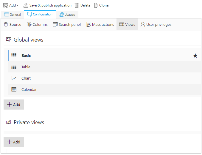
Each new report will have one Basic view (marked with a star) available from the start.
Any other view can be set as the default view. To do this, select Mark as default from the drop-down menu on the right (icon with three dots).
Three types of views are available:
- Table – display data in the form of a table, with the possibility of adding custom text filters and sorting options, turning columns into hyperlinks to relevant workflow instances, and adding an action menu for quick operations on workflow instances.
- Chart – aggregate data on workflow instances and display it as various charts. It is possible to nest further charts within the first one – clicking on one of the displayed values will load the next chart level (filtering down the displayed results to the selected value), which can be another chart or a table report.
- Calendar – display WEBCON BPS instances as calendar events in the perspective of a month, week, day, or as an agenda.
Once a view is created, it can be marked as either Public or Private. In the latter case, the personalized view created by the user will not be visible to others. It is also possible to clone public and private report views. The entire configuration of the view is then cloned, and its original name is supplemented with the copy number in parentheses.
For all view types there are sections for filtering data (as in the Source tab) and defining Additional filters so that data can be organized and presented exactly according to the user's needs. In addition, the tabs of all views have the Miscellaneous section where Instance start buttons and Mass action buttons can be configured (this option is not available for the Calendar view). You can choose custom Grouping and Style settings for Table and Chart views, while for Table and Calendar you have additional options to configure the Search panel.
For detailed information on how to configure different types of report Views along with examples, see the dedicated sections below.
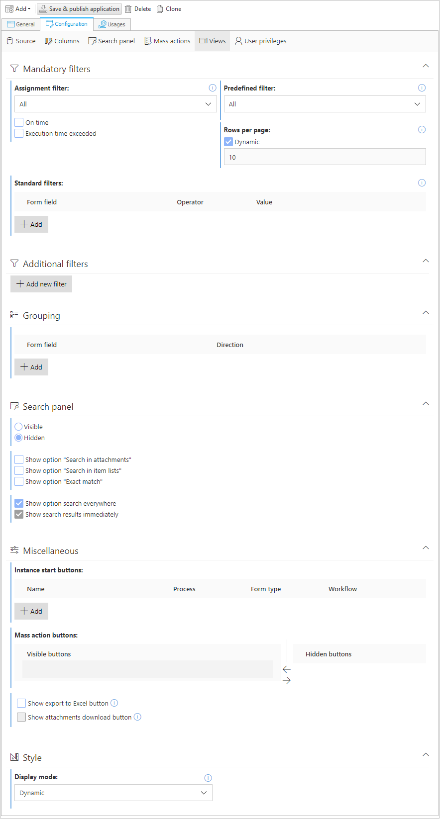
Table view configuration
You can configure the individual columns of the Table view using the following options:
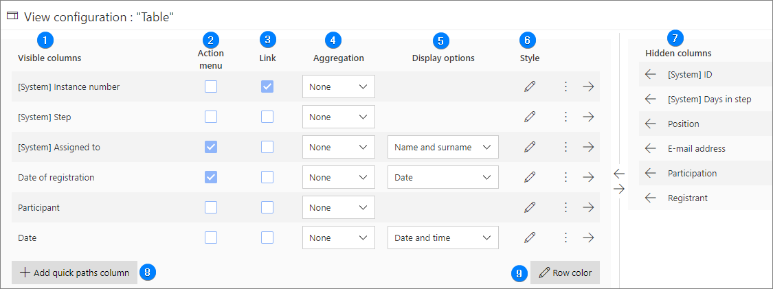
1. Visible columns
Columns available in report: system (default) and process (user-defined) columns.
2. Action menu
If you check the box for the selected column, a menu will appear that allows you to view tasks and use path buttons directly from the report.
3. Link
If a link has been created for a report column, clicking on the value in this column will redirect the user to the workflow instance (skipping its preview).
4. Aggregation
Allows you to aggregate the values with which the form fields have been completed – data can be presented as Count. This option is particularly useful for numerical form fields.
5. Display options
Depending on the form field type, it allows you to define how the values will be displayed in the report. For example, in the case of the Date and time form field, the value can be displayed as year, month and year, full date, etc.
6. Style
When you click on the pencil icon in this column, a configuration window opens where you can set the column Width and select one of the following cell Coloring modes:
- Advanced – configuration in Advanced mode is possible by using the JSON format. Here you can also use built-in icons, refer to quick paths with the ability to draw them as a button, add variables representing the logged-in user ("CurrentUser.BPSID" and "CurrentUser.DisplayName"), color calculated cells, and refer in conditions to the values of other columns.
- Conditions – this mode uses conditional instructions and the operators available depending on the data type of the selected column. In the Conditions mode, it is possible to compare the value of the selected column only with a constant value.
7. Hidden columns
Source columns that will not be displayed in the report.
If a column is hidden, its visibility in the Default view of the Columns tab will also change. Similarly – unchecking the visibility of a column in ths tab will automatically move it to the Hidden columns section. Changing one configuration affects the other.
8. Add quick paths column
Allows you to define a column to perform tasks for several instances at the same time. Such a column can also contain a dedicated button.
The article Quick paths on our technical blog provides detailed information on this subject.
9. Row color
You can define conditions for coloring a row. Click on the Add condition button and specify a condition that must be met (depending on the data type of the selected column) for the row to be colored.
For more information see: Cell coloring in reports and Advanced cell coloring in reports.
Chart view configuration
You can define multiple chart levels. Each chart level has the following configuration options:
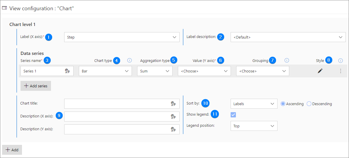
1. Label (X axis)
Values on the horizontal (category) axis. The axis label can be the value of any Column available in the report (either system or process column).
2. Label description
You can define your own label descriptions; however, if a Default description is selected, it will correspond to the values indicated in the Label (X axis) field.
3. Series name
Name of the data series presented on the chart. The field is mandatory, but the value entered in it will not be shown on the chart. The default series name is "Series 1", another is "Series 2", and so on. You can create any number of series.
4. Chart type
Choose between Line, Bar, Pie, Donut, Stacked, Stacked (percentage), Floating bar, and Horizontal bar chart types.
5. Aggregation type
The type of information that is displayed on the vertical axis. If Minimal/Maximal value, Sum or Average is selected, the vertical axis will display the calculated value for individual categories (values of the horizontal axis). Setting these aggregation types requires selecting a form field that contains numerical values in the Value (Y axis) field. Count is used to display the number of workflow instances corresponding to specific categories (values of the horizontal axis).
6. Value (Y axis)
This field is active if the indicated Aggregation type is other than Count. When you expand the list, only Report columns containing numerical values will be prompted to you.
7. Grouping
This parameter allows you to select a grouping column in order to further split the data in series. As a result, depending on the grouping column value, additional series will be automatically drawn for one series of data. In this case, the series name provided in the configuration will be ignored and replaced by the names resulting from the group values.
8. Style
When you click on the pencil icon, a window is displayed where the parameters for configuring the appearance of the chart are available, such as Fill color, border visibility, style, and width settings. These parameters vary depending on the selected Chart type.
9. Chart descriptions
- Chart title – title displayed above the chart.
- Description (X axis) – description of the horizontal (category) axis.
- Description (Y axis) – description of the vertical (numerical values) axis.
10. Sort by
Sorting options for the data displayed on the chart. Labels (X axis) or values (Y axis) can be arranged in either Ascending or Descending order.
11. Show legend
When this box is checked, the view displays values according to the Grouping settings. The legend can be positioned above/below the chart or on either side of it.
Also, if you press the Add button, the tab allows you to create new Chart levels. The bottom-most chart level can be a Detailed data level, i.e. a table.
The end user can interact with the chart by disabling certain strings of data – by clicking on them in the chart legend.
The main feature is the ability to filter data by moving between the chart levels.
Example of different chart levels:
Level 1 chart is a bar chart that displays the count of workflow instances in each step. The individual steps of the workflow are represented on the label column (X axis), and the height of the bar (Y axis) represents the number of instances in that step.
By clicking on one of the bars (representing workflow steps), the end user is shown a level 2 chart, which is a pie chart that shows how many workflow instances are assigned to each employee in that step.
Clicking on one of the pie char segments (representing an employee) takes the user to the final chart level, i.e. detailed data level. This is a table that displays workflow instances assigned to the employee selected on level 2 chart and that are in the step selected on level 1 Chart.
Detailed information on how to configure chart views is available in the article New features of charts in reports.
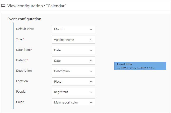
Calendar view configuration
The view displays WEBCON BPS instances as calendar events by mapping form fields or calculated columns selected in the view configuration (set in the Report columns tab) to the event properties such as: Title, Data from, Date to, Description, Location, and People. In the Color field, you can choose the color of an event displayed in the calendar. The available options are Main report color, Alternate report color, Application color, Custom color, and Dynamic. When configuring this view type, a preview of a sample event is displayed on the right.