Pie and Donut charts
Pie and donut charts are used for displaying a single data series. These charts cannot display negative values. Each category (label column) – whose corresponding value in the data series column is positive – is presented as a section on the circular chart. Pie and donut charts illustrate the value of each element in proportion to the total value of all elements.
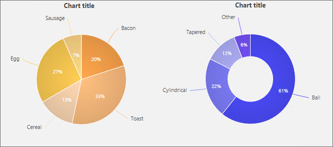
The title is placed above the chart, as shown in the example above. The X and Y axis labels are not displayed.
Categories (label column) are displayed as the names/labels of individual sections. Additionally, each section displays a percentage which represents its contribution to the total size of the chart.
Additional information can be viewed by hovering the mouse cursor over individual segments. Clicking a section highlights it by sliding it slightly away from the center.