Widget
The form field provides an attractive visualization of numeric data on the form. Users select the displayed data and can present it against other values for context.
Advanced configuration
To access additional configuration options, click the Advanced configuration button available in the bottom, right corner of the form field configuration window. Clicking the button opens a separate window with two tabs:
General
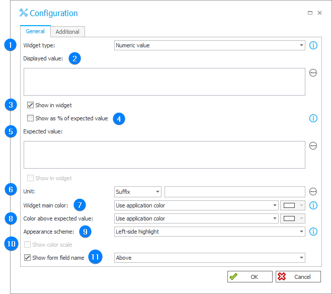
1. Widget type
The parameter determines the type of visualization used. You can select one of the four available options:
- Numeric value – the displayed value is represented as a tile with a specific scheme and color specified in the widget configuration. The expected, minimum, and maximum values are not displayed for this widget type, but can be defined and used to determine the color,
- Progress bar – the displayed value is represented as a progress bar in the color specified in the widget configuration. The visualization can also include the expected, minimum, or maximum value,
- Circular progress bar – the displayed value is represented as a circular progress bar in the color specified in the widget configuration. The visualization can also include the expected, minimum, or maximum value,
- Gauge – the displayed value is represented as an arc (gauge) in the color specified in the widget configuration. The visualization can also include the expected, minimum, or maximum value.
2. Displayed value
The main value displayed on the widget. You can enter the value directly by inputting it in this field or indirectly, e.g. by means of a rule, an SQL query, or a process/business constant.
3. Show in widget
Selecting the checkbox displays the value provided in the field above it.
4. Show as % of expected value
The parameter determines whether the widget displays a value or a percentage indicator representing the proportion of the displayed value in relation to the expected value.
5. Expected value
A numeric value used as a reference point for the displayed value. You can enter the value directly by inputting it in this field or indirectly, e.g. by means of a rule, an SQL query, or a process/business constant.
6. Unit
The field allows you to add a Prefix or Suffix unit to the presented values. You can determine the unit using variables.
7. Widget main color
The parameter determines the color to be used for visualizing the displayed values.
8. Color above expected value
An additional color designated for values exceeding the expected value. If a value meets this condition, the specified color will be applied for the bar both above and below the expected value.
9. Appearance scheme
The option available for the Numerical value widget type. The field allows you to choose how the displayed value is highlighted. Available options: Left-side highlight, Top-side highlight, Fill, and No highlight.
10. Show color scale
The checkbox allows for displaying the scale of colors which are used for visualizing values on the widget.
11. Show form field name
The parameter enables or disables the form field name on the widget. If checked, you can specify the location where the name will be displayed.
Additional
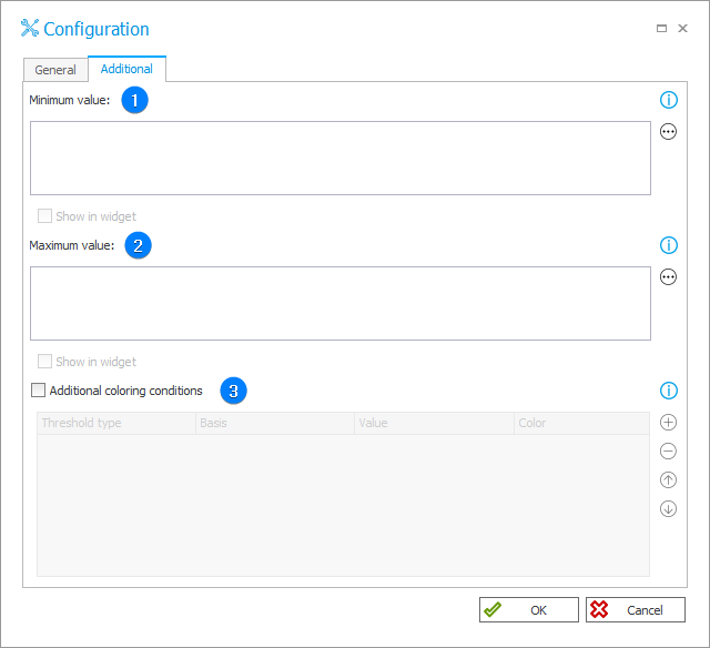
1. Minimum value
The field allows you to specify the minimum value used to visualize progress. You can enter the value directly by inputting it in this field or indirectly, e.g. by means of a rule, an SQL query, or a process/business constant.
2. Maximum value
The field allows you to specify the maximum value used to visualize progress. You can enter the value directly by inputting it in this field or indirectly, e.g. by means of a rule, an SQL query, or a process/business constant.
3. Additional coloring conditions
After selecting the checkbox, you can configure parameters that define an additional color scale to be used for displayed value if it reaches specified limit value. The parameters can be configured within four table columns:
- Threshold type – determines how threshold is defined, i.e. as a percentage or numerical value,
- Basis – available for percentage-type threshold. It enables reference to expected, minimum, or maximum value,
- Value – defines limit value from which a threshold will be applied,
- Color – color to be applied if displayed value exceeds or equals the limit value defined by a given threshold.
The color settings defined in the Additional coloring conditions field take precedence over the settings provided in general parameters (Widget main color, Color above expected value).
If a value meets more than one condition, the color is determined according to the threshold basis in the following sequence: Minimum value, Expected value, Maximum value.
If thresholds have the same basis, a threshold with a bigger limit value is used.
Examples
For more information on widgets, see THIS ARTICLE on our technical blog.