Creating and editing color themes
System themes cannot be edited. However, users with administrative privileges can clone existing system themes or create new ones from scratch, and then modify selected parameters as needed.
WEBCON BPS provides a simple and intuitive interface for creating and editing color themes — no knowledge of style sheets or detailed color definitions is required.
Theme creation
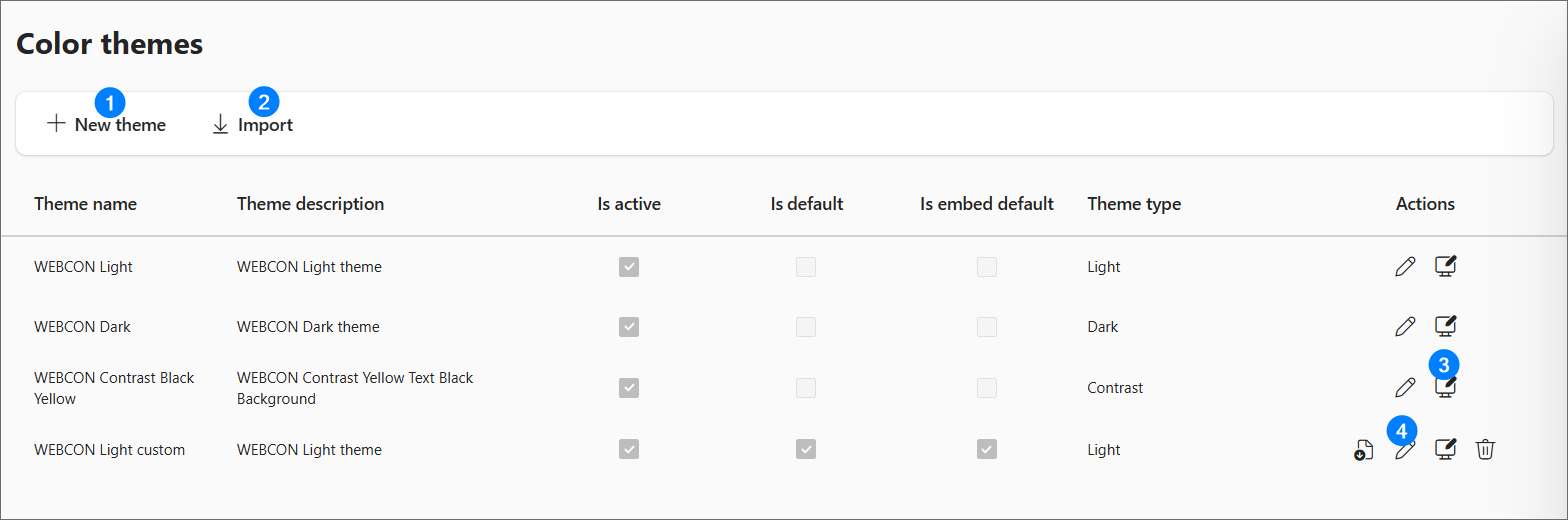
- New theme – allows creating a new color theme from scratch using the parameters described below.
- Import – enables importing a .json file containing a theme definition.
- Clone – duplicates an existing theme, which can be customized by adjusting its parameters.
- Edit – opens the configuration window for the selected theme.
Creating a new theme and editing an existing one are performed using the same configuration interface. Completing all configuration sections allows generating a coherent color scheme applied consistently across the system.
Theme configuration
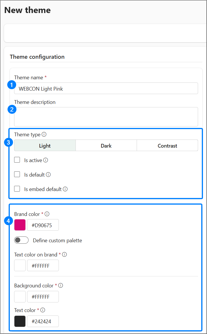
- Theme name – should reflect the character of the color theme as precisely as possible.
- Theme description – not visible to the end user; used to store additional information about the style and to help administrators distinguish between themes without having to analyze detailed parameters.
- Theme parameters – the four basic theme settings (theme type, active, default, embed default) that determine how it is used in the Portal. A detailed description is located in the Theme settings section.
- Base colors – this section allows definition of four key colors for the entire system:
-
Brand color,
-
Text color on brand,
-
Background color,
-
Text color.
Based on these values the system automatically generates a complete palette of color variables used in the Portal interface. If a UI element requires a different shade, the system automatically selects an appropriate shade based on the base colors in order to maintain element visibility.
Brand color – the color defined as the brand color represents the system’s primary color. It may not be applied directly to UI elements, but it serves as a reference point for the algorithm that generates shades of the individual components of the theme.
infoChanging the brand color affects many user interface elements, therefore special care should be taken when modifying it.
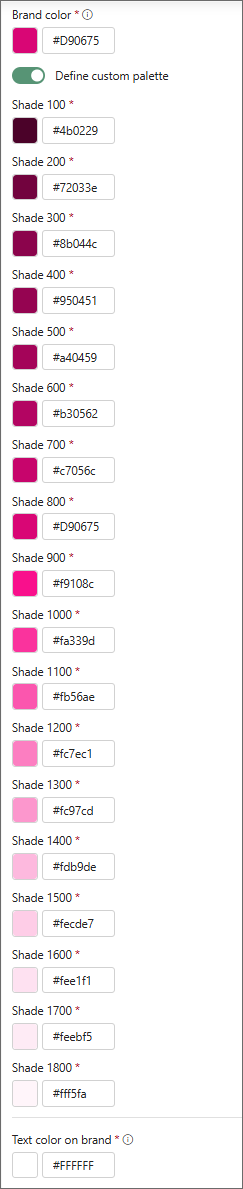
After selecting the Define custom palette option, it is possible to fine-tune the shades of the colors that make up the brand palette; these shades will be used in various system elements.
Text color on brand – the color of text displayed on elements using the brand color. Setting this color ensures appropriate contrast and readability of text on buttons, active tabs and other interface elements that use the brand color.
Background color – the primary background color of the application interface.
Text color – the default text color used in the application interface.
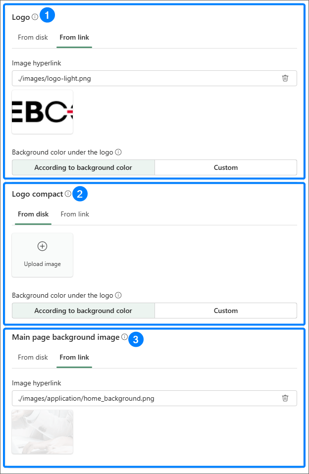
Logo and image
-
Logo – the image displayed in the top-left corner in the expanded navigation bar. Recommended size: 145×32 px. Recommended format: .png. The .svg format is not supported by mail clients.
-
Logo compact – a minimized form of the logo displayed, for example, in the collapsed navigation bar or in mobile device interfaces. Recommended size: 44×32 px.
Both types of logo can be uploaded in two ways — by providing a link or by uploading a file from disk. The background color under the logo is by default generated from the background color, however a custom background color can be defined.
-
Main page background image – the image displayed in the header of the homepage. Recommended size: 1920×270 px. The graphics can be uploaded from disk or a link to the file can be pasted.
Using files with dimensions other than the recommended ones will cause the image to be automatically scaled while preserving aspect ratio. Using a larger file with preserved proportions may be justified when working with high-resolution monitors.
Additional parameters
-
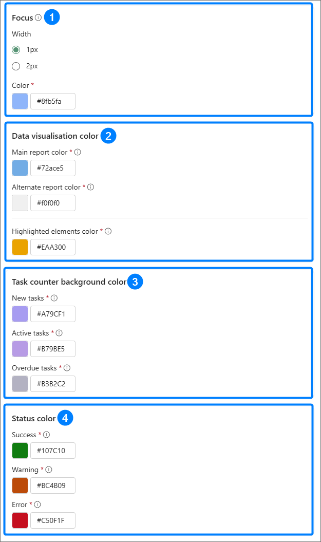
Focus – defines the appearance (width and color) of the visual highlight for a UI element in an active state. These values affect visibility and accessibility of elements in accordance with WCAG standards.
-
Data visualisation color
Main report color – the base color used in reports and other visual system elements such as data in graphical reports, calendar-view reports or widgets where the Main report color option is selected. This parameter is a global setting that can be overwritten in the configuration of an individual report.
Alternate report color – the color used in reports and visual system elements such as data in graphical reports, calendar-view reports or widgets where the Alternate report color option is selected.
Highlighted elements color – the color used to highlight selected interface elements, e.g. selections in dashboard edit mode, the active Favorites icon, the active substitution indicator.
-
Task counter background color
New tasks – the background color of the new tasks counter visible on the homepage and in applications,
Active tasks – the background color of the active tasks counter,
Overdue tasks – the background color of the overdue tasks counter.
-
Status color
Success – the color used to mark elements and messages indicating successful operation, e.g. correct data save,
Warning – the color used to highlight messages and interface elements indicating situations that require user attention.
Error – the color used to mark messages and interface elements indicating an error occurrence.
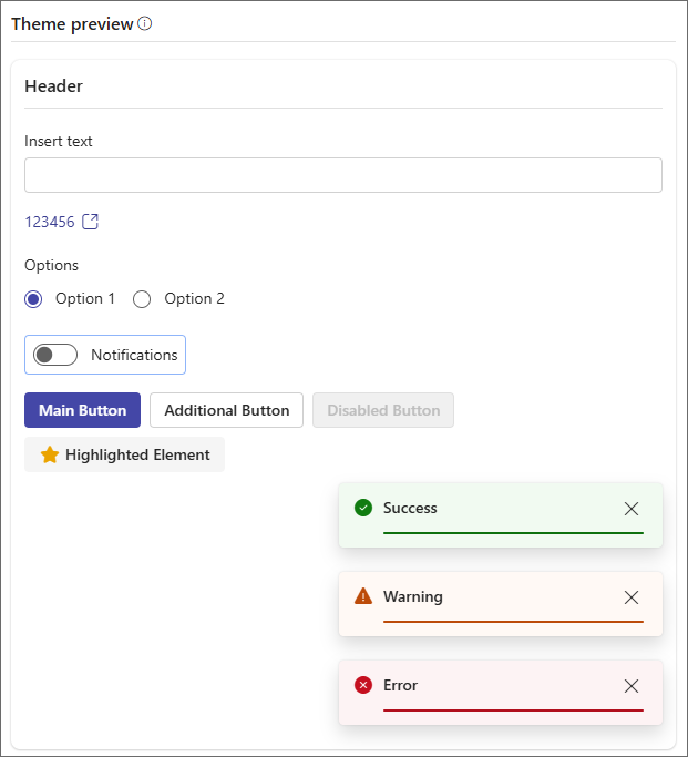
Theme preview
On the right side of the theme editor window there is a real-time preview available that allows immediate verification of the effects of applied changes. The preview shows only basic components; however, the theme itself will be applied to all parts of the system. The preview is not available on narrow screens.
This functionality does not support creation of rigidly defined brand themes, i.e. themes where color values are permanently tied to a brand’s visual identity. If such a theme is required, individual colors may be modified via configuration of a custom CSS stylesheet.
Only HEX format colors are allowed in the theme configuration (e.g. #33ff11). Additional validation mechanisms also apply – the system does not allow creating two themes with the same name. If a duplicate name is detected, a suffix will be automatically appended to the new theme, e.g. “(2)”.