Widgets
Dashboard Widgets in WEBCON BPS are graphical components that enable data visualization and interaction with processes directly from the application level. These components can be configured and customized to meet user needs.
Widget groups
Widgets available on the dashboard are grouped according to the type of data presented or the function they serve.
Reports
The dashboard allows embedding reports that are independent of application reports. These reports use dashboard data sources that are created or assigned at the time of widget embedding.
The configuration window for reports created within the dashboard differs slightly from the application report configuration window. In this context, the main difference is the lack of ability to create private views.
Add existing report or report tile
This button allows copying an existing dashboard report, report tile, or application report. The entire configuration of a given element along with the data source (unless it’s a report or report tile already belonging to the same dashboard) it uses is copied.
- In the widget panel, click the Add existing report or tile button.
- In the newly opened window, in the Specify the report or report tile field, choose the report or tile to be copied and click Continue.
- Make any necessary changes in the report configuration window and click Save in the bottom-right corner.
Table
This report displays data in a classic table format, allowing for detailed data analysis.
Chart
This report presents data as charts, enabling quick visual interpretation of trends and relationships.
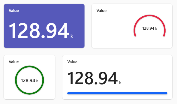
Report tile
A simplified report form that presents key data (e.g., numbers, statuses) in a compact format, ideal for quick previews.
- Drag the tile icon to a selected empty space on the grid.
- In the Select dataset for report tile window, create a new or select an existing dashboard data source that will feed the tile with data. (If a new source is created, it must be configured within the next window.)
- In the Definition tab of the tile configuration window:
- In the Field control, specify the process or system form field whose values will be displayed in the tile.
- In the Aggregation field, select one of the three available data processing types (Sum, Average, or Count).
- Define optional filters in the Filters or Additional filters section.
- In the Style tab, define the tile appearance:
- Choose the tile type (Numeric value, Progress bar, Circular progress bar, or Gauge).
- In the Tile layout scheme section, choose one out of the three available options (No accent, Top accent, or Left accent).
- Define tile parameters in the Basic parameters section (options depend on the selected tile type).
Calendar
A calendar-format report showing data assigned to specific days, useful for planning and schedule review.
Document templates
The report displays a list of document templates added to the application. The report tile is visible only if a document templates process was created in the application.
Dictionary
Displays data entered by users within a dictionary process in tabular format. The report tile is visible only if a dictionary process exists in the application.
Vacation Schedule
A Gantt chart-style report showing non-working days. The report tile is visible only if a vacation process exists in the application.
If a visibility rule is defined for the form field included in the report configuration, an respective message is displayed next to the relevant column in the View configuration section (under the Definition tab), informing that the column may be hidden in the report.
Clicking the header of a report embedded in the dashboard opens it in full-screen view.
Additional dashboard elements
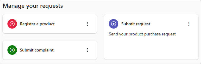
Start group
This widget allows grouping Start buttons in one organized place on the dashboard. Its height automatically adjusts to the number of buttons it contains. The widget also enables creating new Start buttons directly from its configuration panel.
- Drag the Start group tile icon to a selected empty space on the grid.
- Toggle header text visibility using the Show header switch and optionally define the header text in the field below.
- In the Align field, choose the alignment method for the widget's elements: Left or Center.
- Choose which Start buttons are to be displayed by dragging them into the widget from the dark gray section below, or select the Show all starts option. To add a brand new Start button, click Add new start (after configuration and saving, it can be dragged into the widget).
Filter
Embeds an interactive widget with filters assigned to the dashboard's data source, allowing users to narrow down the data shown in the Reports group widgets. Filters embedded within the widget are those created in the dashboard’s Filter panel.

- Drag the Filter tile icon to a selected empty space on the grid.
- Choose filters to be embedded in the widget from the panel on the right by selecting the appropriate checkboxes. This panel allows selecting filters previously created in the dashboard’s Filter panel. The appearance of each filter depends on the data type in the corresponding data source columns.
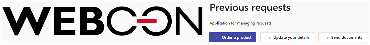
Description panel
Allows adding a block with text, images, and navigation buttons. It offers layout variants for adapting the presentation format to the content.
- Drag the Description panel tile icon to a selected empty space on the grid.
- In the right-hand panel, select a layout scheme: Image on the left, Image on the right, Image in the center, or Image filled.
- Enter name and description for the widget. (Removing values from the Name and/or Description fields and saving the dashboard configuration will cause them not to be displayed.)
- Choose an image to be displayed inside the widget by providing a local path (Image from disk) or a URL (Image from link). In both cases, you can define Image alternative text, which is shown if the image can’t be displayed or read by screen readers.
- In the lower panel section, configure the buttons displayed in the widget by setting their name (the Text field) and the target element (report, Start button, or dashboard) to which it redirects (Link). A maximum of four buttons can be added per widget.
Navigation grid
The widget contains configurable tiles that redirect to specific components of the application (Start buttons, reports, or dashboards).
- Drag the Navigation grid tile icon to a selected empty space on the grid.
- Enable or disable the header display using the Show header checkbox, and optionally define its name in the field below.
- In the Layout section, choose one of the available options: Large image, Large icon, Small image, or Small icon.
- Set the content alignment in the tile by selecting Left (
 ) or Center (
 ).
). - In the section below, configure the tiles displayed within the widget. Choose either Image from disk or Image from link to specify the image to be displayed in the tile. In both cases, it is possible to define Image alternative text that will be shown if the image cannot be displayed or read by screen readers.
- In the Name and Description fields, enter the title and description of the tile, respectively.
- Specify the name of the button displayed inside the tile in the Button text field.
- In the Link field, specify the element (report, Start button, or dashboard) to which the user will be redirected after clicking the button.
- To add another tile, click the Add button.
Separator
Allows you to divide the grid area. The widget appears as a horizontal line across the full width of the design grid (12 columns). Once placed, it marks the upper boundary, to which any widgets placed below it are automatically aligned.
Data analysis and special reports
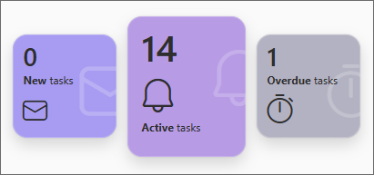
Task counter
Displays the number of tasks in the application divided into new, active, and overdue categories. It allows for a quick overview of current user tasks. The widget requires no configuration by the user.
KPI
Displays aggregated values from a selected field. For this type of report, the Search panel and Mass actions tabs are not available in the configuration window.
Performance indicators
Displays data from performance indicators configured within the application.
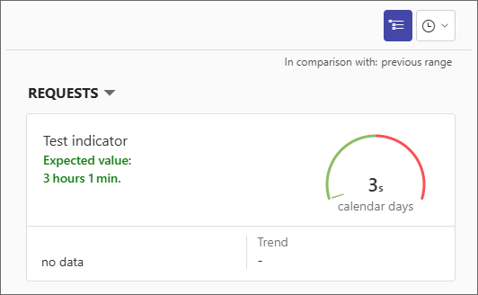
- Drag the Performance indicators tile icon to a selected empty space on the grid.
- From the panel on the right, select the indicators to be displayed in the widget (performance indicators must be properly configured in the application process beforehand).
- Specify Horizontal align by selecting one of the available dropdown options: Left, Center, or Right.
- Check or uncheck the Show filters box to display or hide the filtering buttons inside the widget.
- Check or uncheck the Show groups box to display or hide the names of processes to which the embedded indicators belong.
To learn more about configuring default values, read the ARTICLE available in the WEBCON Community website.
Power BI
Allows displaying a Power BI report. For Power BI reports embedded in the WEBCON BPS Portal to function correctly, the correct application ID must be provided.
More information on Power BI reports can be found in THIS ARTICLE available on the technical blog.
Text, media and content
Text
The widget contains a text field with formatting options, used to add descriptions, headings, or instructions. The widget does not require additional configuration.
Image
Allows inserting a link to a selected graphic file.
- Drag the Image tile icon to a selected empty space on the grid.
- In the Image hyperlink field, enter the URL of the selected image.
- Optionally define a redirection URL in the Redirect URL field, to which the user will be redirected after clicking the image.
- The Alt text field allows for entering text that will be shown if the image cannot be displayed or read by screen readers.
- To enable automatic widget height adjustment to its content, check the Automatic height checkbox.
HTML Code
Allows you to directly add HTML code, enabling full content customization.
- Drag the HTML code tile icon to a selected empty space on the grid.
- Enter the HTML code in the window that opens immediately after dropping the tile onto the design grid.
- To enable automatic widget height adjustment to its content, check the Automatic height checkbox.
Other
Find instance
Enables quick search for an instance by ID, signature, or both, facilitating faster access to specific instances.

- Drag the Find instance tile icon to a selected empty space on the grid.
- In the side panel on the right, choose the type of information to search by (Instance ID, Instance number, Instance ID and instance number).
Application description
Displays basic information about the application, such as its name and description, application owner, and task counter.
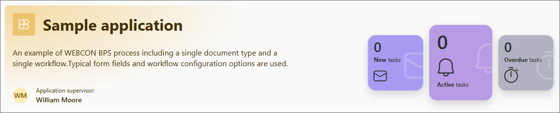
- Drag the Application description tile icon to a selected empty space on the grid.
- In the side panel on the right, select the items to be displayed in the widget (Title and description, Application supervisor, Task counter).
Recent activities
Displays a list of recent activities by the user, subordinates, or all users with access to the application, making it easier to track changes and actions.
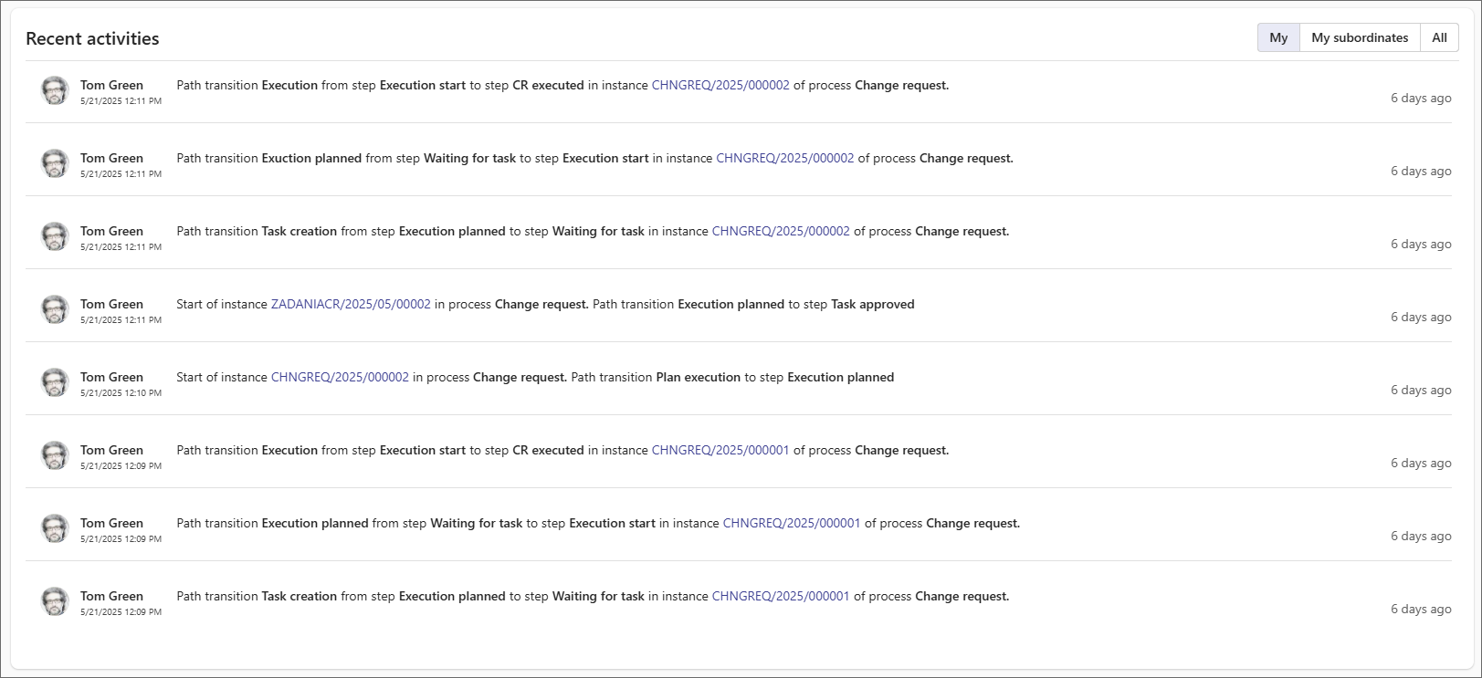
- Drag the Recent activities tile icon to a selected empty space on the grid.
- In the side panel on the right, enter the widget’s header name in the Header field.
- In the Views section, define which views will be available in the widget (My, My subordinates, All).
- Set the widget’s default view in the Default view section.
- In the Number of activities field, define the number of items to be displayed in the widget (the default value is 15).
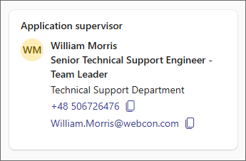
Application supervisor
Displays contact information of the application supervisor, including their position, department, phone number, and email address. The widget appears as a tile with standard user information. The only configuration available is enabling or disabling the widget header (Show header) and optionally defining it.
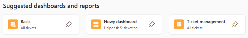
Suggested
Displays recommended reports and dashboards that may be useful to the user at a given stage of work.
The only configuration available is enabling or disabling the widget header (Show header) and optionally defining it.
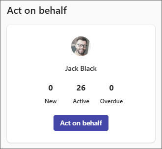
Act on behalf
Allows performing tasks on behalf of another user, e.g., during their absence. To display data of substituted users in the widget, it is necessary to configure a substitution enabling work on behalf of another person.
Managing widgets on the dashboard
Widgets embedded on the dashboard can be modified using the context menu that appears when hovering over the tile of the embedded widget (this menu is only available in dashboard edit mode).

1. Edit
Opens the widget configuration panel, allowing modification of its settings. This button is unavailable for non-configurable widgets, such as the Task counter widget.
2. Move
Allows moving the widget tile within the design grid. To move the widget, click and hold the Move button, then drag it to the desired location and drop.
3. Clone
Clones the widget along with its configuration, creating an exact copy on the dashboard.
4. Remove
Removes the selected widget.
Resizing the widget
The user can manually change the width of all widgets embedded on the dashboard. To do so, after enabling edit mode, hover over the right or left edge of the widget and drag it to set the desired width. The set width is immediately filled with the widget's content or expands as more content is added.

Additionally, for report widgets (e.g., Table or Chart) and Image or HTML code, users can change their height manually or select the Automatic height option to adjust the height to the content. The height of other widgets is always automatically adjusted to their content.