Form
A form is a Portal page that facilitates the exchange of information between the user and the application. It allows you to execute your assigned tasks, provide required data and documents, as well as gain access to information entered by other workflow users.
As a form end-user in Portal, your ability to modify its appearance and fields is limited. However, you can make these modifications in Designer Studio by selecting the Main form or Compact form node on the selection tree.
Form areas
The form consists of several interlinked yet functionally different areas. By utilizing these areas, you will be able to perform various operations, ranging from entering and displaying data to checking the workflow instance history.
1. Form menu
The form menu is a horizontal bar that groups buttons on its left and right sides, facilitating the management of workflow instances and data entered on the form.
Left-side buttons
You can configure the visibility of buttons available on the left side of the form menu (except the Return and Edit buttons) in the Field matrix. Below is a description of these buttons:
- Return – opens the previous Portal page,
- Edit/Cancel editing – enables/disables edition of form fields,
- New – initiates new workflow instance,
- Save – saves the current form (including all information entered in form fields),
- Delete – deletes current workflow instance,
- Refresh – refreshes the currently opened instance,
- Available paths – allows you to select available workflow paths,
- Delegate – assigns task to a given user.
In addition to the buttons provided above, the form menu can include buttons that trigger specific actions and automations.
To learn more about form menu, read the ARTICLE available in the WEBCON Community website.
Right-side buttons
On the right side of the form menu, additional buttons are available, such as:
-
Share publicly/active shares (
 ) – allows you to share a given workflow instance with other users and manage shared instances,info
To learn more about sharing instances, read the ARTICLE available in the WEBCON Community website.
-
Admin (
 ) – enables admin mode. By clicking the button you can display the gear button (
 ) which gives you access to the following options:
- Privileges – displays a window containing information about individuals with privileges for the instance,
- Finish all users' tasks – allows you to complete tasks assigned to other users in administrative mode,
- Timeouts execution statistics – displays a window containing information about execution of actions triggered On timeout that have been invoked within the currently opened instance,
- Word template printout – generates a text file based on the form, containing values from the form fields of the currently opened instance,
- HTML Template – allows you to download an HTML template that is populated with data entered on the form,
- Word template – allows you to download a Word template that is populated with data entered on the form.
-
History (
 ) – displays workflow instance history window,
To learn more about instance history, read the ARTICLE available on the WEBCON Community website.
- Copy form URL to clipboard (
 ) – copies link to a given workflow instance which can be pasted in a text field,
 - Go to form page (
 ) – opens page of a specific form,
 - Show info panel (
 ) – shows or hides Info panel.
Note that the availability of the above-mentioned buttons can depend on the context in which form is displayed (e.g. workflow instance history cannot be displayed on the starting step) or configuration of individual functionalities in Designer Studio.
2. Form fields area
The form fields area occupies the central, visually distinct area of the form window. As it incorporates form fields, most operations involving entering, editing, and displaying data take place within it. What is important, the area is divided into a maximum of four panels, aiding in the organization of the aforementioned form fields.
3. Path panel
The panel is positioned just below the form sheet. By clicking the buttons within it, you can determine the path the instance takes within the workflow. It is important to note that the number of available buttons depends on the paths leading out of the current step where the instance is located.
You can modify the appearance of path buttons in Designer Studio in the Parameters tab of path configuration window.
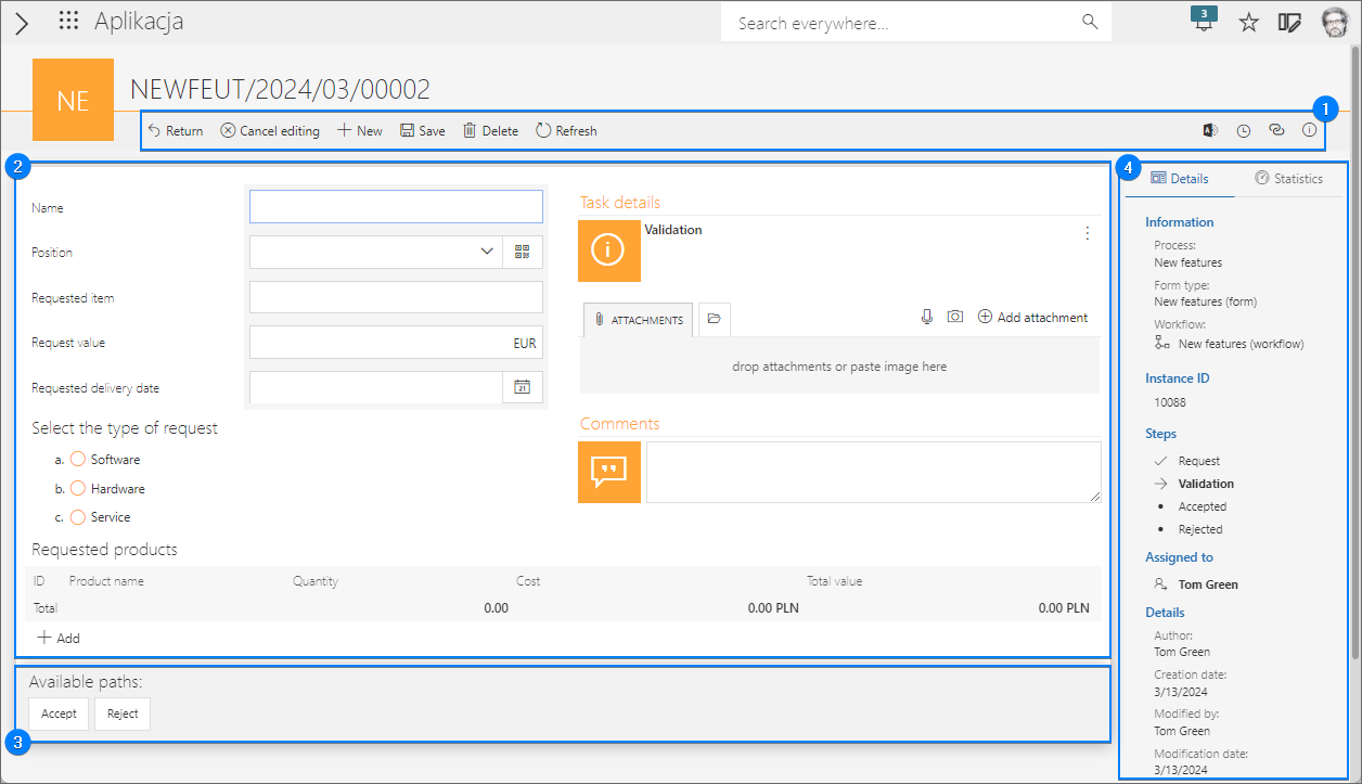
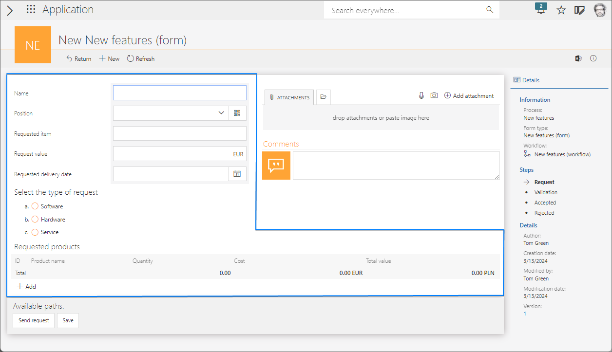
4. Info panel
All information about the current workflow is on the right side of the form window in the Info panel. This panel is by default visible, but you can expand the form sheet area by clicking the Show info panel button on the right side of the form menu to hide it.
The Info panel consists of two tabs: Details and Statistics. You can define individual fields available in these tabs using the Field Matrix at the Designer Studio level.
The first tab contains general information about the current workflow instance. This allows you to quickly familiarize yourself with, among other things, its context, individuals who modified it, and the timestamp of these modifications. A more detailed description of the fields available within this tab is provided below:
- Information – the heading contains information about the current instance, such as Process, Form type, and Workflow,
- Instance ID – an identifier of the current workflow instance,
- Signature – a signature of the current workflow instance,
- Steps – a list of steps available in the current instance workflow. On the left side of each step there is a checkmark symbol (if the instance left a given step), arrow (if the instance is currently in a given step), or bullet (if the instance has not reached a given step yet),
- Assigned to – details of the individual currently assigned to the task,
- Substitutions – the heading is visible when the Use automatic task delegation checkbox is selected and a substitute person is assigned,
- Parent workflow – details about the parent workflow, hyperlinked with its name for quick access,
- Subworkflows – details about any associated subworkflows, if present, linked to the current workflow,
- Details – the heading groups detailed information about the current workflow instance, such as Author, Creating date, Modified by, Modification date, and Version,
- Instance QR code – the heading contains a button that allows you to generate a QR code with a hyperlink to the current workflow instance,
- Instructions – the field is presented as text with a hyperlink to the manual, facilitating work with the current workflow.
The Statistics tab provides statistical data for the currently opened workflow instance, including:
- Total duration – the total time from creating the workflow instance to entering the final step. In the case of transitioning from the final step to other step, the time spent in the final step is included,
- Form filling time – the total time that the users spent on editing the form,
- KPI by step – a visual representation of key performance indicators defined for each workflow step,
- Performance indicators – gauges presenting the user-defined performance indicators. Those indicators track time required for completing tasks in a manner defined by the user.
Form fields
The form fields available in Portal are analogs of the form fields created and configured in Designer Studio. Depending on the defined type, the form fields can be used for entering, editing, or displaying data.
Your ability to edit form fields depends on the settings inputted in Field matrix in Designer Studio and can differ among individual workflow steps. The form fields configured as Read-only or Read-only (cannot be modified except by JavaScript) in Field matrix are displayed as greyed-out (inactive) fields on the form.
For a bigger number of form fields, application designers often use groups or tabs which can facilitate form field arrangement and the overall form clarity. The groups appear on the form as headings containing user-defined form fields below them. Tabs, on the other hand, are created within a panel and display form fields when their heading is clicked.

To learn more about form field groups, read the ARTICLE available in the WEBCON Community website.
System areas
In addition to the form fields mentioned above, the form sheet can include – and by default includes – the so-called system areas. Those are in fact three predefined form fields which, as mentioned before, are by default visible on the right side of the form sheet. (Similar to the form fields, their availability and location are defined under the form configuration in Global form template and Field matrix tabs respectively).
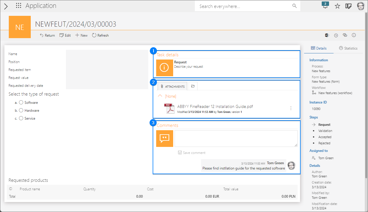
1. Comments
The section enables users to input a text value as a comment for the currently opened workflow instance. Once the text is entered and the Save comment button is pressed (or a path is transited), the system records the text below the mentioned field, along with a timestamp and the author's details. Please note that any user with permission to view an instance can add comments (once added, comments cannot be edited). Additionally, it's important to remember that the Comments field can be edited even when the form is displayed in the read-only mode.
2. Attachments
In this section, you can effortlessly attach files to the form. It's important to note that, by default, there are no restrictions on the type, number, or size of attachments. However, these settings can be modified by the application designer in the Designer Studio.
Unlike other system areas (the Comments and Task details fields), configuration of the Attachments section can be modified by application designer under the Global form template and Attachments node.
Section tabs
The bar of the Attachments section is divided into the following three tabs:
- Attachments – contains attachments added to the instance in the current workflow,
- All attachments – contains all files added during task execution in the associated workflows (parent workflows and subworkflows),
- E-mail conversations – enables saving as attachments all messages sent through Outlook Classic add-on which are associated with the context of the current workflow instance.
To learn more about attachments, read the ARTICLE available in the WEBCON Community website.
How to add an attachment?
The Add attachment button enables you to add files to the form displayed in edit mode. Subsequently, these files are presented in alphabetical order under the Attachments and All Attachments tabs. (Additionally, if categories are created in Designer Studio, the files are assigned to those categories). Clicking the inverted ellipsis button, situated to the right of each added file, allows you to download, display, overwrite, and edit the file along with its attributes.
If there are at least two files added, you can use the Download all attachments button to download them all at once.
Capturing photos and recording voice memos
In addition to adding existing files, the Attachments section also enables you to capture photos and record voice memos, which can then be added to the form as attachments.
-
Capturing photos
To capture photos, click the button that is available in the Attachments section bar. This will open the Camera window.
From there, you can either capture photos (Take photo) or add an existing photo file from your disk (Add from library). Additionally, you can choose the camera to be used, provided that your device is equipped with more than one (Switch camera).
After taking a photo, you can crop it by dragging the lines placed on the photo and also rotate it (Rotate). However, if you are not satisfied with your modifications, you can easily undo them by clicking the Undo changes button or delete the photo entirely (Delete).
The file name is automatically generated by the system in the defined format. To change it, click the arrows button and enter your desired changes in the Filename field. You can also assign the file to an attachment category if one has been defined by the application designer in Designer Studio. -
Recording voice memos
At the form level, you can also record voice memos and add them as attachments. This functionality is accessible by clicking the button in the Attachments section bar. Clicking this button opens the voice memo recording window.
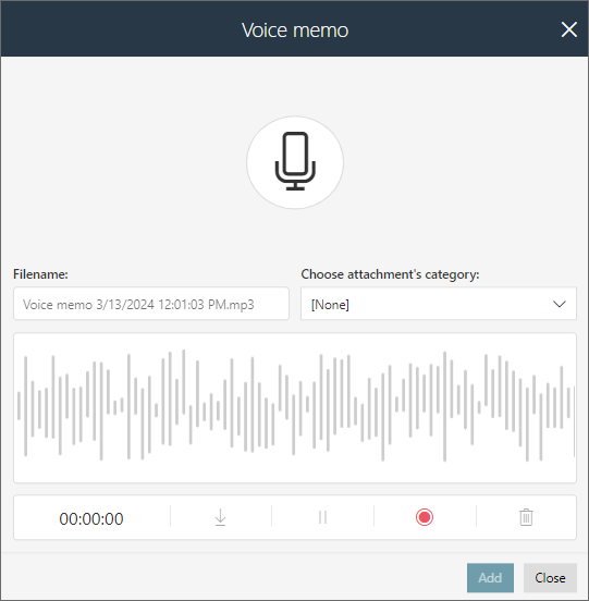
The window contains a simple audio recorder. You can start recording by pressing the Start recording button or a large microphone icon. The initiated recording can then be paused and resumed by clicking the Pause recording and Resume recording buttons, respectively. Once it is completed, i.e., after hitting the Stop recording button, you can download the file containing the recording (Download), delete it (Remove), or add it to form attachments (Add).
Similarly to capturing photos, you can change the name of the file before adding it to attachments in the Filename field and define its category (Choose attachment's category).
3. Task details
The section contains description of a task to be executed in a given step. This description is defined in Designer Studio by the application designer in the Description field in the step configuration window.