Dashboards
Dashboards are virtual desktops that present data from within the application, help with navigation, and provide users with convenient access to relevant areas and information.
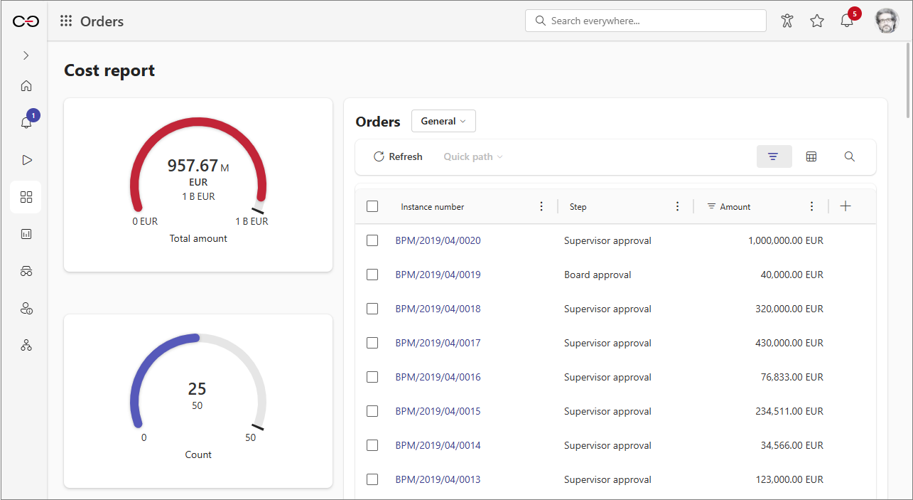
Default application dashboard
The so-called default application dashboard is created automatically upon application creation. It includes standard elements such as the Task counter widget, buttons for registering new instances, and the Frequently used applications and Available applications sections.
The default application dashboard also serves as the application's main page. While it cannot be deleted, its content can be freely modified.
You can restore the default appearance of this dashboard at any time using the Restore default configuration button, which is available in the dashboard toolbar after enabling the application edit mode.

Application dashboards
Users can define additional dashboards for any application and customize their content to meet specific requirements. Dashboards can contain various elements (widgets), such as reports, Start tiles, performance indicators, and navigation widgets that allow users to access other dashboards or application reports.
Configuration
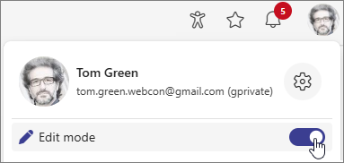
To create a new or edit an existing application dashboard, you must enter the application edit mode. To enable the edit mode, go to the target application, open the User menu and click the Edit mode button.
Only users with the required privileges (Application administrator or System administrator) can create and configure dashboards. Each application dashboard can be configured.
Dashboard configuration is generally possible only in Portal, but please note that Designer Studio also offers some options in this regard. Using the Dashboards node in Designer Studio, users can create new dashboards, as well as name and describe them (Name and Description). Additionally, you can use the Configuration button here to open the dashboard configuration window in Portal.
Creating application dashboard
Once you enable Edit mode, click the Add new button in the Navigation menu and select the Dashboard option.
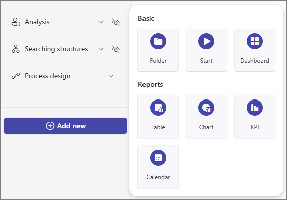
After selecting this option, the dashboard configuration window opens. Here, you can modify the dashboard's layout and content.
Defining the dashboard layout
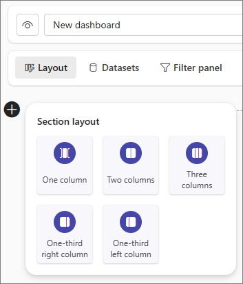
The Layout tab is the primary editing window for the dashboard, where you can define its appearance. Begin the configuration by specifying the dashboard sections where you can embed widgets. Users can select a section with one of the five predefined layouts by clicking the plus button on the left side of the dashboard and choosing an option from the Section Layout menu. It is possible to add multiple sections with different layouts within one dashboard.
Embedding elements within a dashboard section
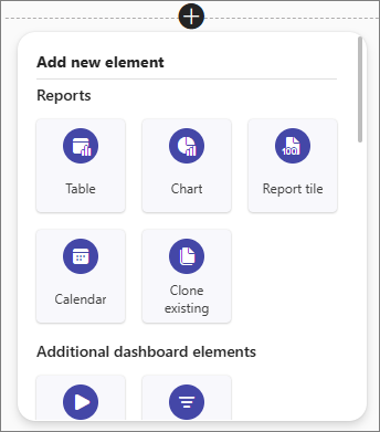
With dashboard section added, you can proceed to embed widgets within it. To do that, click the plus button visible in one of the section segments and select the required option from the Add new element menu.
Dashboard widgets
Below is a list of elements that you can embed on the dashboard.
Reports
The dashboard allows you to embed reports that are independent of application reports. To create a new report, you need to define a data source for the dashboard or associate it with an existing one.
- Table – a report in the form of a table,
- Chart – a report in the form of a chart,
- Report Tile – a tile that displays specified information in a simplified form,
- Calendar – a report in a form of a calendar,
- Clone existing – the option allows you to clone an existing dashboard report, Report Tile, or application report. The cloning includes the complete configuration of the selected element, including the data source it utilizes (unless it is a report or Report Tile that belongs to the same dashboard).
The configuration window of a report created within a dashboard is slightly different from the configuration window of an application report. Although both windows generally contain the same options (excluding the capability to create private views in dashboard reports), they are arranged differently within tabs. This is demonstrated by the Definition tab, which allows you to configure both the data source and report columns. It is also worth noting an additional tab, Adjust Layout, which allows you to define a custom location for the report widget on the dashboard, and rearranged order of the tabs themselves.
If a visibility rule has been defined for a form field included in the report configuration, a corresponding message is displayed in the View configuration section (under the Definition tab) next to its corresponding column to inform users that this column may not be visible in the report.
By clicking the header of the report embedded in the dashboard, you can display it in full-screen mode.
Dictionary reports
- Document templates – contains a list of all document templates added by the application users. Along with the report, a dedicated data source is created for the dashboard unless the report is associated with a different source that matches its type and is available for the dashboard,
- Dictionaries – contains a list of dictionary elements added by users. Along with the report, a dedicated data source is created for the dashboard unless the report is associated with a different source that matches its type and is available for the dashboard.
Additional dashboard elements
- Start – allows you to add one of the configured Start buttons.
- Filter – embeds a widget containing filters selected by the user which have been defined in the Filter panel tab for the specific dashboard dataset. Using these filters, users can limit the data presented in reports and Report Tiles on the dashboard which utilize the dataset for which the filters were created.
- Description panel - enables users to create an element with a text description, image, or buttons that navigate to other areas of the application, such as dashboards, reports, or Start buttons. The widget offers several layout options, allowing users to match its appearance with the displayed content.
- Navigation grid - allows users to define multiple navigation tiles that include a short text description and image. Each tile can be configured to link to an application element (such as another dashboard, report, or Start button) that opens when the tile is clicked.
The Description panel and Navigation grid widgets can only be added within the One column section.
Data analysis and special reports
- Task Counter – displays information about tasks from the application (New tasks, Active tasks, Overdue tasks),
- KPI – displays aggregated values from a given field. For this report type, the Search panel and Mass actions tabs are not available,
- Vacation schedule – a tabular report that presents a summary of vacation days. Its configuration window does not include the User privileges tab,
- Performance indicators – a widget that presents data from performance indicators that are configured within the application,
- Power BI – allows users to display a Power BI report. For Power BI reports to work properly within the WEBCON BPS Portal, it is necessary to provide the correct application ID in the System settings.
To learn more about the Power BI reports, read the ARTICLE available in the WEBCON Community website
Text, media and content
- Text – a text field that provides various formatting options,
- Image – allows you to provide a link to an image,
- Embedded element – allows you to insert an object that redirects to a website, e.g., a table written in HTML, YouTube video, or an RS report,
- HTML code – enables you to insert an HTML code.
Miscellaneous
- Refresher – automatically refreshes the dashboard in the selected time interval,
- Find instance – allows searching for an element by its ID, number, or both,
- Application description – a short description of an application,
- Recent activities – displays recent activities,
- Application supervisor – displays the application's supervisor,
- Suggested reports – displays suggested reports,
- Act on behalf – allows one user to perform tasks on behalf of another.
For each dashboard column, you can change the vertical alignment of the embedded elements to position them on top or in the center of the column. You can place any number of elements in a column.
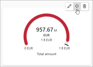
If you want to move an element to a different column or section, or rearrange elements, hover over the element you want to move. A menu with three options will appear on the right. Click and hold the middle button in the menu to drag and drop the element to the desired location on the dashboard.
To configure the custom location of an element within the column section, i.e. set its position relative to other dashboard elements, click the pencil button. In the newly opened element configuration window, navigate to the Adjust layout tab. Here, you can define the individual margins of an element by inputting their values in pixels.
Dashboard data sources
Users can create data sources assigned directly to dashboards and manage them. These data sources can then be reused to populate various reports embedded on the dashboard.
-
Creating a data source for a dashboard
Users can create a data source for a dashboard while creating a report (except for KPI and Vacation Schedule reports which do not utilize data from data sources). After selecting the report type from the Add new element menu, the Select dataset for report or report tile menu appears.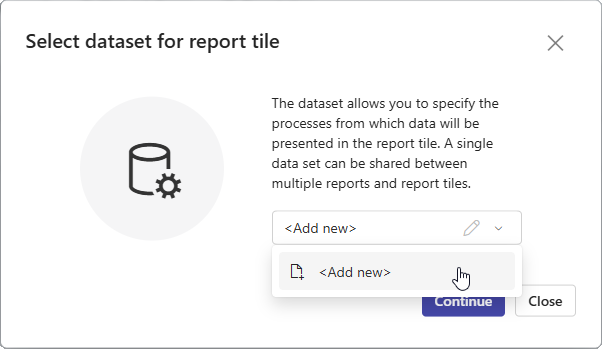
The window allows you to associate the created report with an existing data source (selectable from a drop-down list and configurable by clicking the pencil button) or create a new one by selecting the Add new option from the drop-down list. The type of data source depends here on the selected report type.
infoUnlike data sources created for application reports, the dashboard data source does not allow users to specify the number of rows displayed per one report page. This option is only available in the dashboard report configuration window.
infoIf a visibility rule has been defined for a form field included in the data source configuration, a corresponding message is displayed in the Dataset columns section (under the Columns tab) next to its corresponding column to inform users that this column may not be visible in the report.
-
Managing dashboard data sources
You can manage the data sources created within the dashboard using the Datasets tab in the dashboard configuration window. The configuration of the selected data source is possible in the right section of the window. Both the tabs and options available here correspond with the tabs and options visible when creating the data source.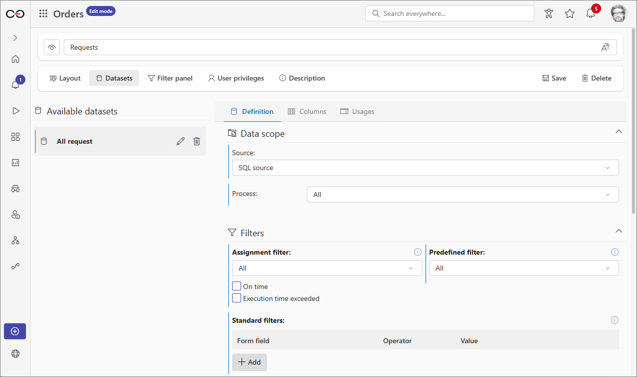
Filter panel
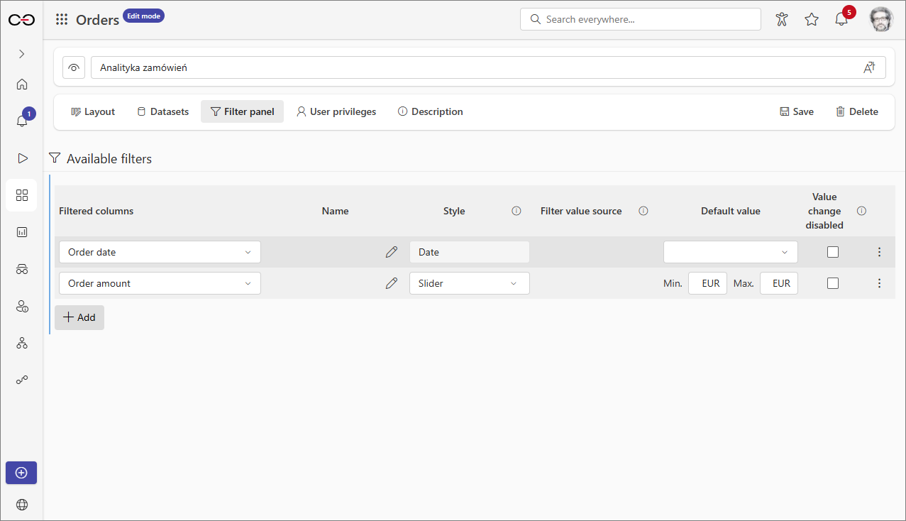
The tab allows users to define filters for the dashboard dataset. These filters can then be applied to the data displayed in reports and Report Tiles which are embedded within the dashboard and use the dataset for which the aforementioned filters were created.
-
Creating filters for dataset To create a filter, select the dataset column that will be used for filtering. To do this, click the Add button, then select the correct dataset and column under Filtered columns.
infoThe type of the selected dataset column determines the content of the Style, Filter value source, and Default value columns. Therefore, please note that the available options may vary for each filtered column.
After adding a filtered column, you can set a name for the configured filter in the Name column and customize the appearance and behavior of the control in the Style column. Additionally, in the Filter value source column, you can specify whether the available values in a filter come from the report data source or a form field data source.
infoYou can define the filter data source for most Choice fields, except for the Date and time form field.
In addition to the options mentioned above, users can also specify the value with which a filter will be loaded in the Default value column. This value can then be locked by selecting the checkbox in the Value change disabled column. As a result, users of the dashboard will not be able to modify the filter value within the Filter widget.
-
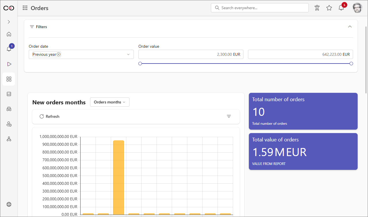
Applying filters with the Filter widget To apply the filters defined in the Filter panel tab, you need to embed the Filter widget in the dashboard. Once you add it, a Configuration panel will appear on the right side of the window. Select the filters to include in the widget and define custom margins if needed.
infoThe appearance of the widget largely depends on the filters embedded within it and the type of filtered columns. Selecting a value within a filter will narrow down the results presented in dashboards and Report Tiles that use the associated dataset.
Privileges to display dashboard
The User privileges tab contained within the dashboard configuration window allows you to specify users or groups who are able to display a given dashboard. By default, the Visibility field for each newly created dashboard is set to Inherited from application. However, users can break the inheritance setting by selecting Custom from the drop-down list. Afterward, clicking the Add button allows you to specify users or groups who are able to display the dashboard.
To learn more about dashboards, read the ARTICLE available on the WEBCON Community page.